Mobile-First Commerce: Optimizing for the Small Screen
The phone has quietly become the primary shopping device for a huge share of customers, and yet many stores are still designed as if the desktop were the default. That mismatch costs sales every day. Designing mobile-first means starting with the smallest, most constrained screen and building up, rather than cramming a desktop experience onto a phone as an afterthought. This guide explains why mobile-first matters and how to optimize every part of the buying journey for the device most of your customers actually use.
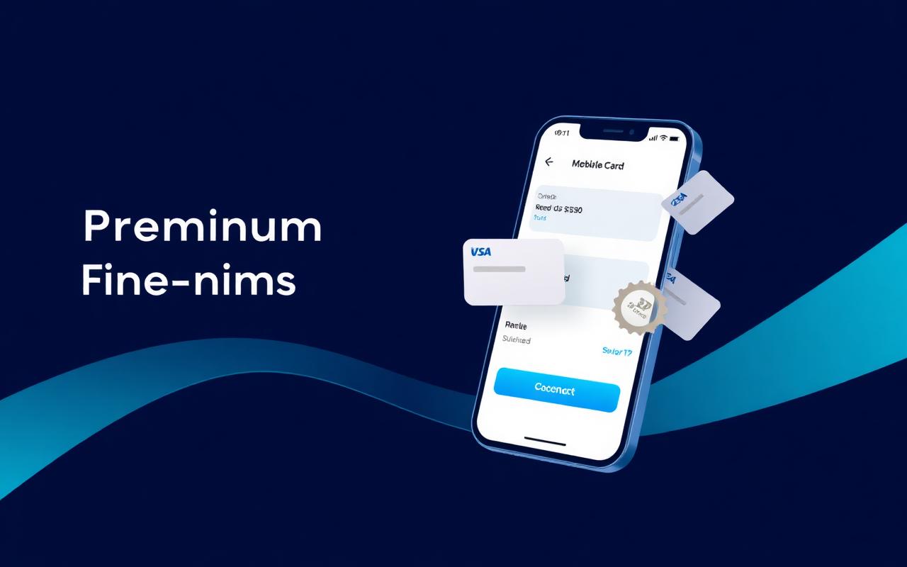
Why Mobile-First Is the Default Now
Designing mobile-first is a discipline, not just a screen size. It forces you to decide what truly matters, because a phone screen has no room for clutter. Everything that survives that constraint tends to make the desktop experience better too, since clarity benefits every device.
The alternative — designing for desktop and shrinking down — almost always produces a compromised mobile experience. Tiny tap targets, cramped forms, and horizontal scrolling are the symptoms of an afterthought, and customers feel them immediately. Starting small avoids these problems by design.
Because so many buyers now begin and complete purchases on their phones, the mobile experience is no longer a secondary channel to support. It is the main stage. Treating it as the primary design target aligns your effort with where your customers actually are.
Speed Is a Feature
On mobile, performance is part of the user experience. Phones often run on slower or less stable connections, and every extra second of load time bleeds away customers. A fast-loading store does not just feel better; it directly converts better, because fewer people give up while waiting.
Optimize the things that matter most for perceived speed: lightweight images sized appropriately for the screen, prioritized loading of what the customer sees first, and minimal unnecessary scripts. The goal is for the page to feel instant, even when the connection is not.
Speed compounds across the journey. A fast home page that leads to a slow product page or a sluggish checkout still loses the sale. Treat performance as a property of the entire flow, from first tap to final confirmation, not just the landing page.
Designing for Thumbs
People use phones with their thumbs, often one-handed, frequently while distracted. Designing for that reality means large, well-spaced tap targets, primary actions placed within easy reach, and an interface that forgives imprecise taps. Buttons that are easy to hit are buttons that get pressed.
Minimize typing wherever you can. Typing on a phone is slow and error-prone, so every field you remove and every input you can simplify makes the experience smoother. Sensible defaults, clear input types, and autofill support all reduce the burden on the customer's thumbs.
Respect the small canvas. Avoid dense layouts, tiny text, and elements packed too closely together. Generous spacing and clear hierarchy help a customer understand and act on what they see at a glance, which is exactly what a distracted mobile shopper needs.
The Mobile Checkout
Checkout is where mobile optimization pays off most directly. A long, multi-step checkout that is merely tolerable on desktop becomes a conversion killer on a phone. Keep it short, keep it to a single flow where possible, and ask only for what is genuinely required.
Offer guest checkout so no one is forced to create an account on a tiny keyboard. Provide the payment methods mobile customers actually use, including fast options that avoid manual card entry. The fewer characters a buyer has to type, the more likely they are to finish.
Make the final action unmistakable. A clear, prominent confirmation button, an obvious summary of what is being purchased, and visible reassurance about security give the mobile buyer the confidence to complete. Ambiguity at the last step is where hard-won sales quietly slip away.
Trust on a Small Screen
Trust signals have to work even when space is scarce. On mobile you cannot rely on a sprawling footer or a wide row of badges. Instead, place concise, meaningful reassurance — security cues, a visible support option, honest social proof — exactly where the customer needs it.
Keep navigation and policies accessible without overwhelming the screen. A customer who wants to check your refund policy or reach support should be able to do so easily, even though those elements are not occupying prime space. Accessibility, not prominence, is the goal here.
Consistency reassures. A coherent, polished mobile experience tells the customer they are dealing with a serious business, while a janky, inconsistent one breeds doubt. On a small screen, where every detail is magnified in importance, that polish carries real weight.
Testing on Real Devices
Simulators and resized browser windows are useful, but nothing replaces testing on actual phones. Real devices reveal the awkward taps, the slow loads, and the layout quirks that simulations hide. Buying or testing on a range of common devices uncovers problems before your customers do.
Test the full journey, not just isolated pages. Walk through discovery, product selection, and checkout end to end on a phone, paying attention to every point of friction. The cumulative experience is what determines whether a sale completes, and only a full walkthrough reveals it.
Keep testing as you change things. Mobile devices, browsers, and customer expectations all evolve, and a layout that worked last year may falter today. Regular, hands-on testing keeps your mobile experience sharp and ensures it continues to serve the audience that matters most.
Key takeaways
- Mobile is now the primary shopping device, so design for it first.
- Speed is a core feature on mobile; slow pages directly lose sales.
- Large tap targets and minimal typing make interfaces thumb-friendly.
- A short, guest-friendly mobile checkout is essential for conversion.
- Test the full journey on real devices, repeatedly, as things change.
Ready to get a verified account?
Browse the marketplace and complete a secure guest checkout — no login required.
Explore the marketplaceContinue reading

Building a Recovery Plan for Your Verified Account
Read: Building a Recovery Plan for Your Verified Account →
Tax Considerations When Using Verified Accounts in 2026
Read: Tax Considerations When Using Verified Accounts in 2026 →